Data Visualization in Python with Pandas and Matplotlib
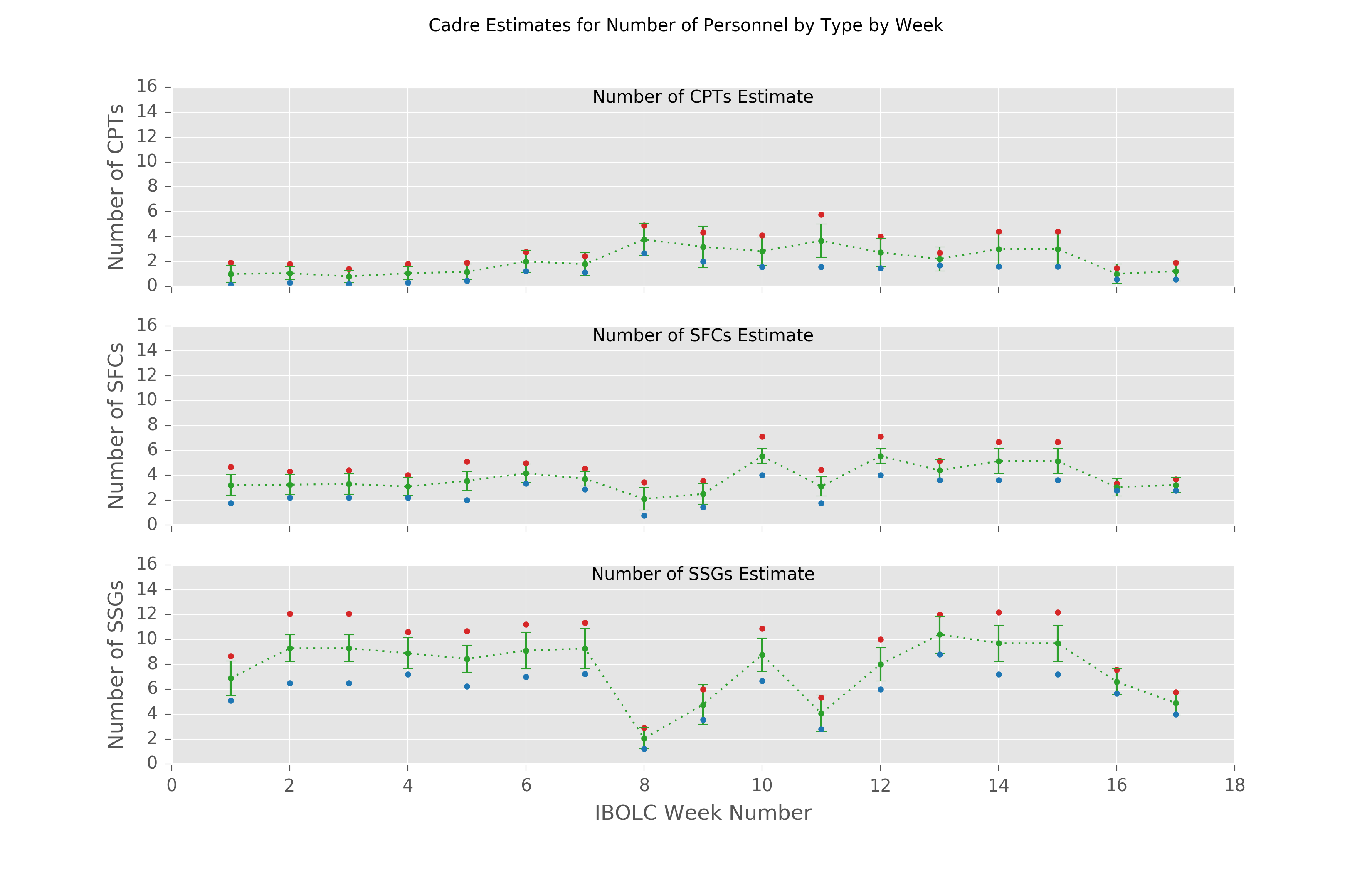
We recently helped my battalion compare different organizational changes by looking at how we place personnel. We wanted to optimize how we assigned personnel to specific jobs. The goal is to place the right amount of people based on the tasks we train each week. To get a feel for how to assign personnel, we asked our coworkers two questions for each training event:
- What’s the fewest number of people you need to successfully run training?
- If you had no constraints, how many people would you like to have to run training?
We gathered 10 responses on 17 weeks of training for 3 ranks with an upper bound and upper bound. So, the total number of data points is data points.
Setup
Thanks to Anaconda, a Python distribution, getting started on Windows was refreshingly straight-forward. The magical sequence of commands to get a working Jupyter notebook was:
conda create -n cadre python=3 numpy jupyter matplotlib pandas
activate cadre
jupyter notebook
The Jupyter Notebook
Jupyter notebooks are amazing for explatory programming. I initially tried to graph the data in Excel, but I couldn’t figure out how to add multiple lines to a plot with a computed standard deviation without making three copies of the data.
First, we have to import the necessary libraries. Pandas is a data analysis library, kind of like Excel in Python. Matplotlib is, as the name hints, a plotting library. The abbreviations for the imports seem to be the standard way of importing pandas and the plotting capabilities of matplotlib.
# Magic comment to display matplotlib charts in the notebook
%matplotlib inline

import matplotlib
import matplotlib.pyplot as plt
import os
import pandas as pd
ggplot is the default style used by the R language. It’s an easy way to get
decent looking charts with little effort.
matplotlib.style.use('ggplot')
Now, we load the data. Pandas will load the data into a data-frame, which lets us do all sorts of neat analysis.
DATA_FILE = os.path.expanduser('~/prog/cadre/cadre.csv')
CADRE_DATA = pd.read_csv(DATA_FILE)
def cadre_estimate(series, rank, bound):
    """Given a dataframe series, return the data grouped by week of an estimate
    for rank and bound."""
    is_rank = series['Rank'] == rank
    is_bound = series['Bound'] == bound

    narrowed_data = series[is_rank & is_bound]
    est_by_week = narrowed_data.groupby('Week')['Est']
    return est_by_week
def get_std_dev_by_rank(series, rank):
    """Compute the standard deviation for rank, by using the mean of the upper
    bound and the lower bound.

    The link below said the right way to do it is to square the standard
    of each bound, divide by the number of samples and take the square
    root of the whole thing.  I'm operating on pretty much blind faith here.
    The website had that trustworthy math-professor feel to it, so I think
    we're good.

    http://mathbench.umd.edu/modules/statistical-tests_t-tests/page05.htm"""

    upper = cadre_estimate(series, rank, 'max')
    upper_std_dev = upper.std() ** 2 / upper.count()

    lower = cadre_estimate(series, rank, 'min')
    lower_std_dev = lower.std() ** 2 / lower.count()

    mean_std_dev = (upper_std_dev + lower_std_dev) ** 0.5

    return mean_std_dev
We want better colors, so we’ll borrow a snippet from a blog post data visualization that uses colors from an advanced data analysis product called Tableau. That blog post goes into much more depth on making good charts based on Tufte’s The Visual Display of Quantitative Information.
colors = [(214, 39, 40), (44, 160, 44), (31, 119, 180)]
tableau_red, tableau_green, tableau_blue = [(r / 255., g / 255., b / 255.) for r,g,b in colors]
Let’s graph the data. This took a lot of tweaking. I finally decided it was good enough.
fig, axes = plt.subplots(nrows=3, ncols=1, sharex=True)
fig.dpi = 300
fig.set_size_inches(8, 7)


plt.xlabel("IBOLC Week Number")
plt.xlim([0,18])
fig.suptitle("Cadre Estimates for Number of Personnel by Type by Week")

ranks = ['CPT', 'SFC', 'SSG']
for ax,rank in zip(axes, ranks):
    ax.set_ylim([0, 16])


    weeks = range(1,18)
    min_bound_mean = cadre_estimate(CADRE_DATA, rank=rank, bound="min").mean().values
    max_bound_mean = cadre_estimate(CADRE_DATA, rank=rank, bound="max").mean().values
    overall_mean = (min_bound_mean + max_bound_mean) / 2


    # Upper bound
    ax.plot(weeks,
            max_bound_mean,
            marker=".",
            linestyle="None",
            label="{} upper bound".format(rank),
            color=tableau_red)

    # Mean of lower and upper bound
    ax.errorbar(weeks,
                overall_mean,
                marker='.',
                linestyle='dotted',
                yerr=get_std_dev_by_rank(CADRE_DATA, rank).values,
                label="mean",
                color=tableau_green)

    # Lower bound
    ax.plot(weeks,
            min_bound_mean,
            marker='.',
            linestyle="None",
            label="{} lower bound".format(rank),
            color=tableau_blue)


    ax.set_title("Number of {}s Estimate".format(rank),
                 fontdict={'fontsize': 10, 'verticalalignment': 'top'},
                 y=0.95)

    ax.set_ylabel("Number of {}s".format(rank))


    ax.yaxis.set_ticks_position('left')
    ax.xaxis.set_ticks_position('bottom')


plt.savefig(os.path.expanduser("~/prog/cadre/cadre_out.pdf"), dpi=300)
plt.show()